Authoring inputs powered by React with reactR
Alan Dipert and Carson Sievert
2024-09-14
Source:vignettes/intro_inputs.Rmd
intro_inputs.RmdShiny comes with a large library of input widgets for collecting input from the user and conveying input data to R.
If you want a kind of input not provided by Shiny — like a color picker, or a different kind of slider — you’ve always been able to build your own. Shiny’s input system is extensible. All that’s required is an understanding of certain conventions and a little custom JavaScript.
reactR provides additional tools to ease the creation of new Shiny inputs implemented using React. In the following tutorial, we will demonstrate these tools by implementing a new Shiny color picker input that wraps the react-color library.
Software pre-requisites
In order to develop a reactR Shiny input, you’ll need to install R and optionally RStudio. If you’re on Windows, you should also install Rtools.
For an excellent general introduction to R package concepts, check out the R packages online book.
In addition, you’ll need to install the following JavaScript tools on your machine:
-
Node.js: JavaScript engine and
runtime for development outside of browsers. Provides the
nodeandnpmcommands. -
Yarn: Command-line
dependency management tool, provides the
yarncommand.
To follow along in this vignette, you’ll also need the following R packages:
install.packages(c("shiny", "devtools", "usethis", "reactR"))Scaffolding
To create a new widget you can call
scaffoldReactShinyInput to generate the basic structure and
build configuration. This function will:
- Create the .R, .js, and .json files required by your input;
- If provided, take an npm
package name and version as a named list with
nameandversionelements. For example, the npm packagefooat version^1.2.0would be expressed aslist(name = "foo", version = "^1.2.0"). The package, if provided, will be added to the new widget’spackage.jsonas a build dependency.
The following R code will create an R package named
colorpicker, then provide the templating for creating
an input powered by the react-color library on npm:
# Create the R package (rstudio=TRUE is recommended if you're not already comfortable with your terminal)
usethis::create_package("~/colorpicker", rstudio = TRUE)
# Scaffold initial input implementation files
withr::with_dir(
  "~/colorpicker",
  reactR::scaffoldReactShinyInput("colorpicker", list("react-color" = "^2.17.0"), edit = FALSE)
)
Building and installing
Building the JavaScript
The next step is to navigate to the newly-created
colorpicker project and run the following commands in the
terminal. If you’re new the terminal, we recommend opening your newly
created RStudio ~/colorpicker/colorpicker.Rproj project
file, then running the following in the RStudio terminal tab:
yarn install
yarn run webpack
yarn installdownloads all of the dependencies listed inpackage.jsonand creates a new file,yarn.lock. You should add this file to revision control. It will be updated whenever you change dependencies and runyarn install. Note: you only need to run it after modifying package.json. For further documentation onyarn install, see the yarn documentation.yarn run webpackcompiles the modern JavaScript with JSX source file atsrcjs/colorpicker.jsxintowww/colorpicker/colorpicker/colorpicker.js. The latter file is the one actually used by the R package and includes all the relevant JavaScript dependencies in a dialect of JavaScript that most browsers understand.
yarn run webpack is not strictly a yarn
command. In fact, yarn run simply delegates to the webpack program. Webpack’s
configuration is generated by scaffoldReactShinyInput in
the file webpack.config.js, but you can always change this
configuration and/or modify the yarn run webpack command to
suit your needs.
Run the included demo
Now that the input’s JavaScript is compiled, and the R package is
installed, run app.R to see a demo in action:
shiny::runApp()In RStudio, you can open app.R and press
Ctrl-Shift-Enter (Cmd-Shift-Enter on macOS).
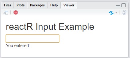
You should see something like the following appear in the Viewer
pane:

Authoring a React input
At this point, we have a working (if simple) React-powered text
input. Let’s modify it to create an interface to the
react-color library.
Connecting Shiny with React
Consider the following example taken from the react-color documentation.
import React from 'react';
import { SketchPicker } from 'react-color';

class Component extends React.Component {

  render() {
    return <SketchPicker />;
  }
}
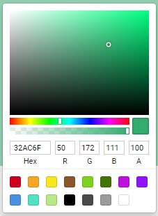
That JavaScript code produces a SketchPicker-type
interface that looks like this:

However, that example doesn’t demonstrate a way to default to a
particular color, or a way to cause something to happen when the color
changes. To accomplish these, react-color components can optionally
take the following props:
-
color: accepts a string of a hex color like'#333' -
onChangeComplete: accepts a JavaScript function taking a single argument, the newcolor, that will be called when the new color is selected
Since this React component calls a configurable function (i.e.,
onChangeComplete) when the input (i.e., color) value
changes, we can supply a function to inform Shiny about these changes.
You could, in theory, do this by writing your own custom Shiny input
wrapper around this component, but reactR provides some
conventions to make it much easier. These conventions have two main
parts (R and JavaScript):
- Use
reactR::createReactShinyInput()to construct the user-facing R input and route any user-supplied options (e.g., thedefaultinput value and otherconfiguration) to the React component. This part was already done for us in theR/colorpicker.Rfile of our colorpicker project:
colorpickerInput <- function(inputId, default = "") {
  reactR::createReactShinyInput(
    inputId = inputId,
    class = "colorpicker",
    dependencies = htmltools::htmlDependency(
      name = "colorpicker-input",
      version = "1.0.0",
      src = "www/colorpicker/colorpicker",
      package = "colorpicker",
      script = "colorpicker.js"
    ),
    default = default,
    configuration = list(),
    container = htmltools::tags$span
  )
}- Design an intermediate React component that routes
information from
colorpickerInput()to the<SketchPicker>component and also inform Shiny when a new color is chosen. This intermediate component should be a functional component with three arguments:
-
configuration: The JSON equivalent of theconfigurationargument fromreactR::createReactShinyInput(). In this particular example,configurationisn’t used. -
value: The input’s values over time, beginning with thedefaultsupplied fromreactR::createReactShinyInput(). -
setValue: A JavaScript function to call with the input’s new value when one is created. This function is not user supplied, but rather an internal hook for informing Shiny about changes to the component’s current state (i.e. value).
Consider the following intermediate component,
PickerInput. Note how this intermediate component allows
one to set the default value from R and also calls
setValue() inside onChangeComplete in order to
inform Shiny about new color values. Finally,
reactR.reactShinyInput() registers this intermediate
component as a custom Shiny input binding named
colorpicker.
import { reactShinyInput } from 'reactR';
import { SketchPicker } from 'react-color';

const PickerInput = ({ configuration, value, setValue }) => {
  return (
    <SketchPicker
      color={ value }
      onChangeComplete={ color => setValue(color.hex) }
    />
  );
};

// Note the first argument here should match the `class`
// argument of the reactR::createReactShinyInput() from step 1
reactShinyInput('.colorpicker', 'colorpicker', PickerInput);
Open the srcjs/colorpicker.jsx file in your colorpicker
project and paste this code into it. After saving the file, run
yarn run webpack in the terminal, re-install the package,
then run shiny::runApp() again
When you select new colors, you should see the
textOutput update accordingly.
You might have noticed that the input showed up initially without a
color selected. That’s because in app.R we didn’t supply a
default argument to the colorpickerInput
function inside our ui.
Try replacing the call to colorpickerInput with this:
colorpickerInput("textInput", default = "#a76161")
Now when you run the app, the color should start as a shade of red.
Further learning
This tutorial walked you through the steps taken to wrap the
react-color library in a Shiny input. The full example
package is accessible at https://github.com/react-R/colorpicker-example. Our
intention is keep creating example packages under the https://github.com/react-R organization, so head there
if you’d like to see other examples of interfacing with React.